browser window with a larger version.
window with the "Interactive Lab Map" web page.
| Introduction | Audience |
|
Escaping Paper |
|
||
| Navigation Map | Virtual Includes |
|
Conclusion |
|
||
|
browser window with a larger version. |
window with the "Interactive Lab Map" web page. |
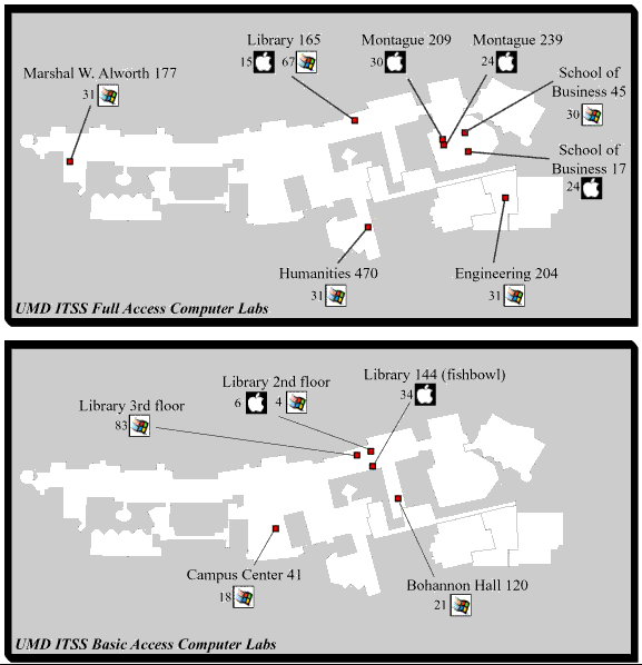
The map of lab resources is another example of how the interactive web medium can enhance documentation. First notice the graphic design of the map. The actual map element has been relegated to the background by simply outlining the general building shapes in light and neutral colors. This allows the primary information, lab buildings & rooms, platform type, and number of units, to be the primary focus. The "apple" icon is a perfect example of a universally understood icon. The object is to present with clarity, precision, and efficiency (Tufte 1983 p. 51). Within the context of "computers," most readers ought to recognize that this indicates an apple computer lab. The windows icon, though a bit less universal, ought to be distinguishable in contrast to the apple, and is distinct and descriptive enough so that a user will learn the significance within the site and easily remember. It is not necessarily true that these are universal icons, but they are certainly reasonable icons that a user can learn and understand fairly quickly.
Building names and numbers are fairly obvious (or again very learnable) and that just leaves the number to the left of each icon, which is the number of computer work-stations available in that room. Because the graphic elements are well chosen, there is no need to clutter the screen with a key or description of the map. This frees up space for more important information and creates a visually pleasing screen that makes it easy for the user to scan and find three pieces of information at a glance in an instant.
The graphic becomes even more valuable as a navigation tool. As the user scrolls over the various labs, the cursor indicates that they can click on that area of the graphic to see more information about the lab. Now the navigation tool changes to reflect the needs of the user. She already has seen a campus map and the general distribution of resources across the campus. At this point she has chosen one lab and the type of information is all focused on that location. Each of the links is a simple and descriptive word or phrase. As the user chooses one or another link, the navigation tool stays the same. Once the user goes back to the campus map and clicks on a different lab location, they will find the same navigation tool.
The navigation tools are simple. each element is an obvious icon or title. Even those things that are not immediately recognized by a given user are easily identified as the user continues using the site, and are applied consistently throughout the site. A good map, a good navigation tool should be obvious enough that no key or instructions are required.
Sparing Use of Color
Note that the only color used in these Maps highlights the two
peices of information that I am most anxious to provide: relative
location, and platform. Edward Tufte points out that "color
spots against a light gray or muted field highlight and italisize
data." He goes on to caution against using too much color
and too many stark contrasts (Tufte,
1990 p. 83). My strategy with these interactive maps is to
communicate where labs are located, in a relative sense, and also
which platforms are avaialbe. Note that the room locations are
the only solid blocks of color anywhere on the map. The "Windows"
logo is a soft splash of color contrasted by the dense balck and
white "Apple" logo. The muted white and gray background
of the map allows these elements to draw the eye, and the image
is devoid of clutter, highlighting the few key pieces of information
I intend the observer to learn.
![]()
![]()
![]()