 |
Previous Blackboard Items
January | February | March | April | May
Blackboard for 1/16 (Tuesday Week 1)

|
 . This page will serve as the home base for our class this semester. . This page will serve as the home base for our class this semester.
I will update this page for each class meeting. Items that appeared on this page from previous meetings can be found via the "<previous Blackboard items>" link at the bottom of this page.
The menu on the left will give you access to other materials related to the course.

 . On the first day, we'll be looking carefully at the syllabus. . On the first day, we'll be looking carefully at the syllabus.
 Tour this site Tour this site
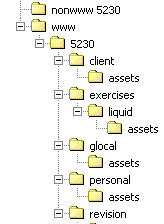
 , please obtain a USB drive (a.k.a., jump drive, thumb drive, key-chain drive), and create a structure of folders that looks like this. You don't need to buy a new drive if you already have one with at least 100 MG of space on it. You can also use a Zip disk, though these are less durable: , please obtain a USB drive (a.k.a., jump drive, thumb drive, key-chain drive), and create a structure of folders that looks like this. You don't need to buy a new drive if you already have one with at least 100 MG of space on it. You can also use a Zip disk, though these are less durable:
|
 |
You will create and turn in a draft or "BETA" version of the PCHP Project, and, a week later, a Final Version. See the schedule for dates.
|
| |
Make a list of "round" characters you can think of from movies, television, books, etc. How do these characters incorporate different, sometimes even contradictory traits?
Brainstorming
- Open up a Word document,
- Save it as “pchp brainstorm” in your “nonwww” folder in a new folder called “pchp” (nonwww/pchp). (If you don't have a USB drive or disk, save this in "My Files" on your desktop for now and move it to your drive next time)
- Type the number “1” at the top
- Below it, type a list of at least 12 places, things, activities, goals, experiences, social scenes, tastes, etc. that are part of your experience and how you identify yourself.
|
Blackboard for 1/18 (Thursday Week 1)

|
 Seating Seating
Please try to sit where you did on the first day. This will help me learn your names this semester.
 Roll Roll
 Questions? Questions?
...on the class? the syllabus? the Personal Course Home Page Project (BETA version due Monday, February 2).
 Course Assessment Course Assessment
As a way of measuring the effectiveness of this class, please answer a few multiple choice quesitons about your experience and confidence (here at the beginning of the semester) with various technical and conceptual areas. Your responses here will not effect your grade in any way.
 , complete the PCHP Brainstorming Session that we'll begin today in class. Bring in a paragraph (Step 5) printed out and the complete "session" (Steps 1-5) on your disk. , complete the PCHP Brainstorming Session that we'll begin today in class. Bring in a paragraph (Step 5) printed out and the complete "session" (Steps 1-5) on your disk.
 . Any trouble getting your USB drives/disks and creating a set of folders that look like this? . Any trouble getting your USB drives/disks and creating a set of folders that look like this?

 Logging Out Logging Out
When you leave today, don't forget to log out of your computer workstation. Double-click the "Logout" icon on the desktop.
|

|
Today, we'll begin a Brainstorming Session for the PCHP following a handout I'll give you in class. Complete this session for next time, and bring in the complete session document on disk. Also bring in the final paragraph printed out.
|
 |
Comment: Liquid Page Design is ideal for pages that contain lots of text because text flows to fill whatever space is available. The page you are looking at now has a "liquid" design. If you resize the width of the page, notice how the content contracts or expands to fill the whatever space you give it. Such a design makes good use of "screen real estate": little empty space is trapped at the top (where the real estate is more valuable) and scrolling is kept to a minimum.
Today, we'll try out Dreamweaver by making a Web page, posting it to the Web, and then visiting that page with our Web browser.
See the in-class handouts, "Liquid Page Design (Dreamweaver)" and "Moving Files to the Web with Dreamweaver"
If we get far enough into these exercises today in class, I will ask you to complete these two exercises by class time on Wednesday. Send the URL to me in an e-mail with the subject line "5230-01 exercise jan 19 "
If we don't get into these exercises sufficiently, we will complete these in class on Tuesday and use the Webx discussion board to post the URLs.
In the "Liquid Page" exercise, I'll ask you to collect some online content from a Web site you like which uses both words and images. I'll use the blog "BoingBoing," which you're welcome to use too if you can't think of something else.
|
Blackboard for 1/23 (Tuesday, Week 2)

|
 Seating Seating
Please try to sit where you did on the first week. This will help me learn your names this semester.
 Roll Roll
on the Personal Course Home Page Project?
Some key terms you should understand:
- "preamble"
- a Web-site "concept"
- "design scheme"
- "round-character" presentation (vs. flat or diffuse)
- setting up a "site" in Dreamweaver (exporting & importing site information in a .ste file)
- liquid page design
- clustering (as a brainstorming technique)
- freewriting (as a brainstorming technique)

1. At the end of class today, I'll announce which exercises you'll be responsible for completing and posting to the Web by Wednesday at 2 p.m., and which exercises we might complete together on Thursday
2. For those exercises that are due by Wednesday at 2 p.m., I'll also ask you to log into the Webx Discussion Board by that same time and send the URL(s) of the exercise(s) in a message to the appropriate discussion(s):
I will give you a handout to follow: Logging into Webx Discussion Board. Please e-mail me if you have trouble reaching the discussion.

I will to collect the paragraphs you wrote as a result of the Brainstorming Session I asked you to complete for today.
I understand that these paragraphs, at this point, are trials and explorations. I just want to see what you're thinking about at this early stage of the assignment.

If you "Exported" your site information from Dreamweaver to your disk last time (as a file called "www.ste") import that file back into Dreamweaver before we begin. Choose Site > Manage Sites and then click the Import button. See page 469 in your Dreamweaver book for directions.
 Xcopy Xcopy
Last Thursday in class, I mentioned a program that comes in Windows XP called Xcopy for automatically and quickly backing up files. See the explanation of Xcopy on the Resources page if you're interested.
 When You Leave When You Leave
When you leave today, don't forget to
- save all your files to your drive/disk
- take your drive/disk
- log out of your computer workstation (double-click the "Logout" icon on the desktop)
|
 |
Today, we'll continue with the exercise "Liquid Page Design (Dreamweaver)," picking up where we left off.
I will also give you Logging into Webx Discussion Board.
To begin this exercise, you'll need to visit the page Beginning Banner Techniques on my Techniques Site to download two images.
|
Blackboard for 1/25 (Thursday, Week 2)

|

on...
Network Problems?
A number of you had problems connecting to the Web with Dreamweaver last time.
Today, everyone should please try re-posting your Liquid Page to your folder www/5230/exercises/liquid to make sure everyone's Dreamweaver is accessing the Web. Please open DW, import your site settings, and write over a copy of the Liquid Page exercise (even if you haven't made any changes).

1. Revise your concept/preamble to improve it, based on some of the principles and responses we'll talk about today. Bring in a printed copy to turn in.
2. Complete the Poynter.org color tutorial "Color, Contrast, and Dimension."
Key Terms to Understand:
- "dimension" achieved with color
- Itten's Seven Contrasts of Color
- hue
- "complementary" colors
- simultaneous contrast
- saturation
- proportion

Choose Start > Programs > Publishing, Graphics, Presentation > Adobe > Adobe Photoshop
|
 |
- In the preamble, list-like chains of topics don't lend much unity, even when the items are glued together with generic transitions like "When I'm not doing X, I like to..." or "For a break, I like to..." If the topics can't be pulled together in the preamble, they're probably not going to seem unified on the Web page. If you mention something only once, maybe you should drop it altogether.
- Instead of lists or chains of topics, use an "umbrella idea" or scene to bring things together. In your draft, look for a "center of gravity"—some line or moment when the writing found itself and made something happen. Start with that in your next draft.
- The first line is vital. Don't start with ritual throat-clearing and general information. Look at your writing and, in a revision, try starting with the best line.
- The shorter the better. Condense, distill, combine sentences, suggest rather than explain, let the part imply the whole. I've never used this version of my home page because I think the preamble is still too long.
- The more concrete and specific the better. Rather than "I like movies," say "My favorite movie of all time is Major League (or Pulp Fiction, or Shrek...." See how it makes a difference?). If the time you spent in Denmark is important, share some tidbit or micro-memory that helps make that time and place real to us....
|
 |
To begin this exercise, you'll need to visit the page Banner Techniques on my Techniques Site to download two images.
If we complete this exercise (or if I assign it to be posted by tomorrow at class time), copy and paste the URL in a message to the Webx discussion banner URLs.
|
Blackboard for 1/30 (Tuesday, Week 3)

|

on...
Complete the Jello Page Design exercise, post it to the Web, and send the URL to the Webx discussion "jello URLs."

Bring in all materials (especially images) to work on your PCHP project. You'll want to find elements to include that recall and fulfill topics you introduce in your preamble (see "How the Preamble Helps..." below).


Choose Start > Programs > Publishing, Graphics, Presentation > Adobe > Adobe Photoshop
|
 |
The preamble is not just a part of your Personal Course Home Page. It also contains, like DNA, the essential plan for the page's whole design scheme.
Read again my attempt at a preamble (still too long!) on this mock-up of my home page, and then try to pick out features and elements elsewhere on the page that recall topics from the preamble.
|
 |
Color (NFL Logo Exercise)
- See the NFL logo page.
- Choose two logos to contrast, download them to your non-www folder, open both in Photoshop.
- Download and open in Photoshop this version of the color wheel.
- Open Photoshop's color picker (click the foreground color tile at the bottom of the Tool Palette) and then "pick" the various colors in the logo.
- Decide which logo you want to talk about mostly (your primary example), and which one you merely want to use for contrast and comparison (the foil).
- In a message to the Webx discussion "color," type in the name of the two logos in the first line (starting with your primary example).
- Starting on the second line of the message, discuss one logo's use of color in the following six ways, mentioning the second logo to compare or contrast. Comment on the use (or not) of all of the following, specifically using these terms. Start with what you think is most surprising or revealing about the logo's use of color:
- "hue" (especially what the color picker shows you about any deviations from pure "primary" colors)
- dimension
- use of "complementary color contrasts" (or the degree that the contrasts are "bent" or not used at all)
- use of "warm" and "cool" colors (in contrast or not)
- "saturation"
- "proportion"
Jello Page Design
Visit the page for Jello Page Design and follow the directions there. You will also receive an in-class handout.
When we are finished, you'll post this exercise's folder (www/5230/exercises/jello) to the Web, visits the page with your browser, and copy the URL into the Webx discussion "jello URLs." |
Blackboard for 2/1 (Thursday, Week 3)

|

on...
To turn in the PCHP Project (BETA) by the deadline:
- Create your PCHP project on your disk in the folder www/5230/personal. Be sure to keep all images in the folder www/5230/personal/assets. Save the page as "index.html" so it will function as the default page.
- Post all the contents of your "personal" folder to the folder www/5230/personal on the server.
- Visit the page with your browser and copy the URL from the location bar
- Go to the Webx discussion "Personal Course Home Page URLs," click "Post Message," paste the URL into the message box, and post it by the deadline.
- Note: there is no commentary required for the BETA version due Monday. You will write a commentary on the final version (Monday 2/12) and turn it in at the beginning of class on Tuesday 2/13.
Read Jakob Nielsen's
Chapter 1, "Why Web Usability?" (page 8), and
Chapter 2 "Page Design" (page 16).
As you read, consider some of the following questions that we'll talk about in class on Tuesday.
- Nielsen says he's "an evangelist at heart" when it comes to usability design. Who's he arguing so passionately against?
- In creating the BETA version of the PCHP project, what "errors" did you commit, according to Nielsen? Are there useful principles and techniques you wish you had known?
- What's the big deal about "screen real estate"?
- How do we make effective use of screen real estate?
- A link can be ineffective, according to Nielsen, even if it works when you click it. How so?
- What's the most surprising fact, opinion, or piece of advice that Nielsen offers in these readings, in your opinion?

 SeaMonkey Suite (Containing "Composer") SeaMonkey Suite (Containing "Composer")
If you would like to work on your Web-based projects at home (and don't want to download the 30-day trail version of Dreamweaver until April 10), you can download and use Mozilla's SeaMonkey Suite, which include's a free HTML editor, Composer
Like Dreamweaver, SeaMonkey's Composer is a "WYSIWYG" editor ("What You See Is What You Get") that writes and revises HTML code. Since HTML is not a proprietary language (requiring corporate-specific software to read), you should be able to move between Dreamweaver and Composer with few problems. Let me know if you do have problems.
I will keep a permanent link to the SeaMonkey Suite's download page on the Resources page.
|
 |
Studio Day
Though we will be working individually for the rest of today, please plan on staying and being productive till the end of class. |
Class Blackboard for Tuesday 2/6
(Week 4)

|

on the Personal Course Home Page Project (BETA)?
To turn in the PCHP Project (Final) by the deadline:
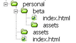
- Copy all the folders and files of your BETA version to a folder www/5230/personal/beta. See directions below in "Archiving the BETA Version"
- Revise your PCHP project on your disk in the folder www/5230/personal. Be sure to keep all images in the folder www/5230/personal/assets. Save the main page as "index.html" so it will function as the default page.
- Be sure that you not only change the "index.html" in the "personal" folder, but upload that changed version of the page to the Web. You can revise and upload as many times as you want. The Web is just another disk to back up on.
- Visit the revised page with your browser to check that all is working.
- Do not repost the URL to the Webx discussion unless the URL has changed. If you do need to change the URL, post the new one in a "reply" to your original message to "Personal Course Home Page URLs" so both messages will appear together.
- Write a commentary on the final version, print it out, and turn it in at the beginning of class onTuesday 2/13.

You should archive the BETA version (save it in a sub-folder called "beta" inside of "personal") so you can preserve the original while you're updating the page for the final version:
- Import your site information ("www.ste" file) into Dreamweaver.
- In the Files Palette of DW, right-click on the "personal" folder, and choose Edit > Duplicate
- Change the name of the new folder from "Copy of personal" to "beta"
- Open the "personal" folder
- Drag the "beta" folder into the "personal" folder (top level). When prompted, choose to "Update Links"
- Check in your Files Palette to see if you now have an arrangement like this:
- Close the "beta" folder and forget it. Make all future changes to the "index.html" page at the top level of "personal," which will become your PCHP Final.
- Post the "beta" folder to the Web (click the "beta" folder to select it in Dreamweaver's Files Palette, and then click the up-arrow icon at the top of the Files Palette.)
- Check that the archived BETA version is online. With your browser, enter the URL for your PCHP (you could click the link in Webx) and add "beta/" at the end: as in "...5230/personal/beta/"
- See if the beta version appears in your browser.
|
 |
Today we'll discuss what we've learned from Jakob Nielsen's chapters that we can use in revising the PCHP, during the rest of the semester, and beyond.
As you read, consider some of the following questions that we'll talk about in class on Tuesday.
- Nielsen says he's "an evangelist at heart" when it comes to usability design. Who's he arguing so passionately against?
- In creating the BETA version of the PCHP project, what "errors" did you commit, according to Nielsen? Are there useful principles and techniques you wish you had known?
- What's the big deal about "screen real estate"?
- How do we make effective use of screen real estate?
- A link can be ineffective, according to Nielsen, even if it works when you click it. How so?
- What's the most surprising fact, opinion, or piece of advice that Nielsen offers in these readings, in your opinion?
|
Class Blackboard for Thursday 2/8
(Week 4)

|
 Roll Roll
on the Personal Course Home Page Project (BETA)?
Personal Course Home Page Project (Final) Due by Monday, February 12 at noon
To turn in the PCHP Project (Final) by the deadline:
- Be sure you have made of copy of all the folders and files of your BETA version to a folder www/5230/personal/beta. This will be the "before" version to your final PCHP's "after."
- Revise your PCHP project on your disk in the folder www/5230/personal. Be sure to keep all images in the folder www/5230/personal/assets. Save the main page as "index.html" so it will function as the default page.
- Be sure that you not only change the "index.html" in the "personal" folder, but upload that changed version of the page to the Web. You can revise and upload as many times as you want. The Web is just another disk to back up on.
- Visit the revised page with your browser to check that all is working.
- Do not repost the URL to the Webx discussion unless the URL has changed. If you do need to change the URL, post the new one in a "reply" to your original message to "Personal Course Home Page URLs" so both messages will appear together.
- Write a commentary on the final version, print it out, and turn it in at the beginning of class on Tuesday 2/13.
Commentary on the PCHP Due at the Beginning of Class on Tuesday, February 13 at noon
See the directions for writing the commentary from the syllabus.
 PCHP Checklist PCHP Checklist
I will give you a copy of the PCHP Checklist.
|
 |
Studio Day
Though you'll be working individually today, plan on staying the entire class period, the same as any other class meeting.
While we won't take time in class to try them out together, you might find following skills from the Dreamweaver book helpful in working on your Personal Course Home Page.
- Making "Relative" Links (winthin your site) by "Pointing to a File," page 66-67
- Making "Absolute" Links (to a page outside of your site), page 66-67
- Image Links, page 217
- Linking to an Email Address, page 218
- Making Text Headings, page 90
- Changing Fonts and Font Size, page 94
- Changing Font Color, page 97
- Using Text Styles, page 98
- Breaking Lines Without Adding a Blank Line, page 101
- Formatting Lists, page 107-108
- Checking Your Spelling, page 129
- Quick Uploading of the Current Page (if you have your site set up in Dreamweaver): Save the page, Look in the tool bar immediately above the page window, Click the down/up arrow button, Choose the "Put" command.
- Quick Uploading of a Whole Folder from the Files Palette, page 50-51.
|
Class Blackboard for Tuesday 2/13
(Week 5)

|
 Roll Roll
on the Personal Course Home Page Project?
 No Class Meeting on Thursday, 2/15 No Class Meeting on Thursday, 2/15
Pick Up PCHP Commentaries
Starting next Tuesday and for the next three class periods, we will workshop the PCHP Projects one at a time in class.
Before class, please do the following:
- Review the workshopping page for ideas about what to discuss in your comments.
- Visit the Personal Course Home Page projects scheduled the class meeting in the schedule below. Before class on workshop day,
- Type and printout written comments and suggestions for each project scheduled for that day. Bring both the printout of your comments and the digital file to class for copying and pasting (explained below).
- Before class starts, copy and paste all the written comments you've made for everyone scheduled for that day into the form "Workshop Comments for Today" and click "Send to Craig." Be sure to label each set of comments with the project number, the name of the project's author, and the correct date of the workshop.
Within 24 hours after the each workshop
- Individually send each author your comments on his or her project by using the e-mail list on the form "Workshop Comments for Today.
|
 |
Introducing the Next Project
Take a look at the assignment page for Glocalization Site Project.
I will give you an brainstorming handout, which I will expect you to complete by next Tuesday.
Post the "glocalbrainstorming.doc" file to your "glocal folder." Then try visiting the .doc file with your browser.
You won't be able to open the file with your browser (it will ask you if you want to open it with Word or download it).
But you can...
- right-click the link to the file from the "index" page and
- choose to "Copy Link Location" (in Firefox).
Paste the URL into a message to the Webx discussion "glocal brainstorm URLs" and post it.
|
 |
We will learn a little bit about what's happening behind the scenes with HTML code. This can help us understand what Jakob Nielsen means when he says we should "separate meaning and presentation."
I will give you an in-class handout.
Send the URL of the final project, posted to the Web, in a message to the Webx discussion "code URLs."

We'll learn to create our own tiling backgrounds in this exercise. See the "Tiling Backgrounds" page from the Techniques Site where you will download an image to use.
I will also give you a copy of the handout.
Send the URL of the final project, posted to the Web, in a message to the Webx discussion "tiling URLs."
|
Class Blackboard for Tuesday 2/20
(Week 6)

|
 Roll Roll
 Questions? Questions?
|
 |
Questions on the Glocalization Project?
Glocalization Brainstorming due Today
By the beginning of class today, please post the "glocalbrainstorming.doc" file you created in the brainstorming session to your "glocal folder."
Then try visiting the .doc file with your browser. You won't be able to open the file directly with your browser (it will ask you if you want to open it with Word or download it).
But you can...
- right-click the link to the file from the "index" page and
- choose to "Copy Link Location" (in Firefox).
Paste the URL into a message to the Webx discussion "glocal brainstorm URLs" and post it.
|
 |
Workshop Today, Thursday and Next Tuesday
Starting today, we will workshop the PCHP Projects one at a time in class.
Before each day's class meeting , please do the following:
- Review the workshopping page for ideas about what to discuss in your comments.
- Visit the Personal Course Home Page projects scheduled the class meeting in the schedule below. Before class on workshop day,
- Type and printout written comments and suggestions for each project scheduled for that day. Bring both the printout of your comments and the digital file to class for copying and pasting (explained below).
- Before class starts, copy and paste all the written comments you've made for everyone scheduled for that day into the form "Workshop Comments for Today" and click "Send to Craig." Be sure to label each set of comments with the project number, the name of the project's author, and the correct date of the workshop.
Within 24 hours after the each workshop
- Individually send each author your comments on his or her project by using the e-mail link on the home pages.
Workshop Resources
|
Class Blackboard for Tuesday, 2/27
(Week 7)

|
 Roll Roll
 Questions? Questions?
 For
Thursday For
Thursday
Please read Jakob Nielsen's Chapter 3 and complete the Reading
Guide. (Note that you can either open the reading guide and fill it out on your computer to print out, or print it out and fill it in by hand. I will ask for hardcopies of this document, rather than electronic copies.) |
 |
Questions on the Glocalization Project?
|
 |
Workshop Today
We will continue workshopping the PCHP Projects one at a time in class.
Before each day's class meeting , please do the following:
- Review the workshopping page for ideas about what to discuss in your comments.
- Visit the Personal Course Home Page projects scheduled the class meeting in the schedule below. Before class on workshop day,
- Type and printout written comments and suggestions for each project scheduled for that day. Bring both the printout of your comments and the digital file to class for copying and pasting (explained below).
- Before class starts, copy and paste all the written comments you've made for everyone scheduled for that day into the form "Workshop Comments for Today" and click "Send to Craig." Be sure to label each set of comments with the project number, the name of the project's author, and the correct date of the workshop.
Within 24 hours after the each workshop
- Individually send each author your comments on his or her project by using the e-mail link on the home pages.
Workshop Resources
|
Class Blackboard for Tuesday 3/6
(Week 8)

|
 Roll Roll
 Questions? Questions?
For Thursday
- Please read Jakob Nielsen's Chapter 4 "Site Design" (starting page 162)
- Bring your Nielsen book!
- Bring in (written down) a new, improved topic/angle for your Glocalizaiton Project along with a list of possible "structual" menu items to organize the site.
Turn in Reading Guide Handouts for Nielsen's Chapter 3
|
 |
Inventing a Glocal Angle on a Local Topic (Brainstorming)
- Copy the following list of topics/angles into a blank page in Word.
- Above the list, insert a 3-column/1-row table
- At the top of the left-hand column, type the heading "Truly Glocal"
- At the top of the middle column, type "Local Only"
- At the top of the right-hand column, type "Not Local"
- Now, imagine you are someone living in Phoenix, Arizona (or wherever) who will never leave Phoenix except via the Web , visiting a Web site created around each of these topics/angles.
- Copy and paste the site topics/angles that you might find compelling, interesting, and relevant to you in the "Truly Glocal" column.
- Copy and paste the site topics/angles that you would not find compelling, interesting, and relevant to you in the "Local Only" column.
- Copy and paste the site topics/angles into "Not Local" that could interest you in a general way but not take you on a virtual visit to some locale (Duluth, Beaners, etc.).
- Reconsider your choices, especially in the "Only" and "Not" columns. If you shared a certain interest, taste, passion, enthusiasm with the creator of the site, could you imagine moving any topics/angles to the "Truly Glocal" column.
- (In parentheses, type in what that special interest, taste, passions, enthusiasm would need to be for that item to stay in the "Truly Glocal" column.)
- What if you changed the wording of the item to re-focus the angle, or took just one of several possible angles. (Indicate such changed items on your list with bold.)
* North Shore State Parks: As winter sanctuaries; As fall color showcases; As a scientific and natural experience; As family vacation sites; As a walk in the woods; As sidekicks to Lake Superior; As an escape from the city
* The Lakewalk: History; Directions; Things to do; Facts; Home; Pictures; Places to go; Things to see
* Bridge
* Mall
* Arrowhead Road
* Skyline Parkway is a road in Duluth with many scenic overlooks of the city of Duluth along with Enger Tower. I was thinking of doing a website telling of all the sights along this road. Maybe giving tips on what to see while driving, biking, or running along this road. If I can I might be able to get a history of the road.
* Basement Parties are a fad among the youth of Duluth, but I have yet to figure out why. There is no head room, (especially for me since I’m 6 foot), the floor is sopping wet, and the smell is repulsive. I have yet to find the joy of being compacted into a cramped, smelly place, rubbing up against sweaty individuals who are guaranteed to spill their beer on you.
* The Glesheen Mansion is a very hot tourist attraction in Duluth. The 39-room mansion was built by the Congdon family. The infamous murder of Heiress Elizabeth Congdon and her nurse, who were bludgeoned and smothered to death in 1977, have created a whirlwind of myths about the mansion being haunted.
* Lutsen Mountain: The only actual Mountain in the Midwest. As an tourist attraction; As minnesota’s window to the rest of the world; As the outdoors; As a get away; As a great way of life
* Living at the top of a hill: As calmness precedes; As the view from the top; As the view of the lake; As the greenery surrounding it; As the sun setting down; As the sun setting up; As the birds that flew by; As the wind going strong; As the winter getting colder and being besides the fire place; As all white in snow; As the colorful leaves the would emerge before the snow; As the leaves that comes back by the spring
* 4-H building at the MN State Fair: As a place in Minnesota; As a tornado-proof building; As a place for friendship; As a leadership experience; As a rite of passage; As social relations; As the face of Minnesota 4-H; As a stage; As a competitive grounds; As the beginning of romance; As a house of memories; As a dance floor
* Hermantown and how is it separate from Duluth: As commerce; As a school system; As services; As stuff to do; As proximity to other Northern Minnesota locations; As informative to someone not from the area (or in this case, this planet…)
* Boundary Waters: -As a fishing area -As a relaxation getaway -As a camping area -As a hiking area -As an adventurous place to visit -As a good time with friends -As a place to go by yourself or very few friends -As a place to see many different nature scenes
* Hartley Park in Duluth: Wildlife; Photography; Trails; Special Locations
* Grandma’s Sports Garden: A website showing the experience of Grandma’s Sports Garden in Canal Park--As a Saturday night hangout for UMD students; As a local bar scene; As a dance club; As a mixture of all ages, races, and sexes; As a sports haven; As a restaurant; As an excellent place to people watch; As a place to unwindAs place to let loose.
* The Iron Range: As a place in northern Minnesota; As a place for immigrants to start a family; As a mass provider of iron; As a cold place; As a rough terrain; As a place of factories; As place full of iron ore; As a place of pits; As a place of old-time hockey; As a Scandinavian melting pot
|
 |
Discussion of Chapter 3
...based on the Reading
Guide
Resources
Christian Sandvig's home page. |

|
Headings: Image into Type (Visual Hierarchy)
 For this exercise, you'll need to visit the techniques page and follow directions there. I will give you a copy of the handout. For this exercise, you'll need to visit the techniques page and follow directions there. I will give you a copy of the handout.
Post this exercise to a folder called "textimage" in your folder "www/5230/exercises". Visit the page with your browser and copy-and-paste the URL into a message to the Webx discussion "image into type."
Note that, once you create this file, you can
- change the "background" image by replacing/hiding the image layer and hitting control+g again
- you can retype the text to make multiple headings from the same file.
Every time you "Save for the Web," you take a snapshot of how this file looks at that moment.
|
Class Blackboard for Tuesday 3/6
(Week 8)

|
 Roll Roll
 Questions? Questions?
For Thursday
- Bring in all materials for working on the Glocalization Project in a Studio Session.
- This will be the last class meeting before spring break and the Glocalizaiton Project due date on Monday, March 19
Responder of the Set (PCHP)
"Rite in the Rain" All-Weather Writing Pocket Notebook" |

|
Questions?
|
 |
Discussion of Chapters 3 and 4
1. From the chapter, choose one principle, technique, or piece of advice which you think is useful, interesting, or questionable.
2. Find on the web a relevant example of a page or site on the Web: that is, one that follows Nielsen's advice (successfully or unsuccessfully), one that ignores Nielsen's idea (either successfully or unsuccessfully), or that calls into question what Nielsen is saying.
3. In a message to the Webx discussion "Nielsen Chapter 3/4,"
- In the first line, type a subject line that describes the advice
- In the first line, type the page number
- On the second line of the message, paste in the URL of the page you chose
4. Starting on the third line, write a brief analysis of how the example you chose fulfills or ignores Neilsen's advice, either to the benefit or detriment of the final product. If the example brings Nielsen's advice into question, explain how. In such a case, is Nielsen wrong? half right? usually right just not in this case?
Resources
Christian Sandvig's home page.
|

|
1. Ripped, Sliced Banner
For this exercise, you'll need to visit the techniques page for the "Image into Type" exercise and download the "cadmt.jpg" image to your non-www folder. Open it in Photoshop. I will give you a copy of the handout.
2. Headings: Image into Type (Visual Hierarchy)
 For this exercise, you'll need to visit the techniques page and follow directions there. I will give you a copy of the handout. For this exercise, you'll need to visit the techniques page and follow directions there. I will give you a copy of the handout.
Post this exercise to a folder called "textimage" in your folder "www/5230/exercises". Visit the page with your browser and copy-and-paste the URL into a message to the Webx discussion "image into type."
Note that, once you create this file, you can
- change the "background" image by replacing/hiding the image layer and hitting control+g again
- you can retype the text to make multiple headings from the same file.
Every time you "Save for the Web," you take a snapshot of how this file looks at that moment.
|
Class Blackboard for Thursday 3/8
(Week 8)

|
 Roll Roll
 Questions? Questions?
Glocalization Projects due by Monday, March 19, noon.
Send the URL of the home page to the project to the Webx discussion, "glocal URLs."
The following computer labs will be open M-F during Spring Break:
- SBE 14 (8 a.m. to 5 p.m.)
- KPL 143 (8 a.m. to 5 p.m.)
Call the Help Desk at -8847 for more information.
For Tuesday, March 20: Commentary
Bring in a printed commentary on your own Glocalization Project to turn in.
For Tuesday, March 20: Prepare for Workshop
- Review the workshopping page for ideas about what to discuss in your comments.
- Visit the Personal Course Home Page projects scheduled the class meeting in the schedule below. Before class on workshop day,
- Type and printout written comments and suggestions for each project scheduled for that day. Bring both the printout of your comments and the digital file to class for copying and pasting (explained below).
- Before class starts, copy and paste all the written comments you've made for everyone scheduled for that day into the form "Workshop Comments for Today" and click "Send to Craig." Be sure to label each set of comments with the project number, the name of the project's author, and the correct date of the workshop.
Write and send your comments on the projects scheduled for workshop starting on Tuesday.
The One-Minute Site
|

|
Studio Session Today
|

|
1. Sliced Borderless Banner
For this exercise, you'll need to visit the techniques page for the "Image into Type" exercise and download the "cadmt.jpg" image to your non-www folder. Open it in Photoshop. I will give you a copy of the handout.
2. Headings: Image into Type (Visual Hierarchy)
 For this exercise, you'll need to visit the techniques page and follow directions there. I will give you a copy of the handout. For this exercise, you'll need to visit the techniques page and follow directions there. I will give you a copy of the handout.
Post this exercise to a folder called "textimage" in your folder "www/5230/exercises". Visit the page with your browser and copy-and-paste the URL into a message to the Webx discussion "image into type."
Note that, once you create this file, you can
- change the "background" image by replacing/hiding the image layer and hitting control+g again
- you can retype the text to make multiple headings from the same file.
Every time you "Save for the Web," you take a snapshot of how this file looks at that moment.
|
Class Blackboard for Tuesday 3/20
(Week 10)

|
 Roll Roll
 Questions? Questions?
Turn in Glocalization Commentary
For Thursday, March 22: Prepare for Workshop
- Review the workshopping page for ideas about what to discuss in your comments.
- Visit the Personal Course Home Page projects scheduled the class meeting in the schedule below. Before class on workshop day,
- Type and printout written comments and suggestions for each project scheduled for that day. Bring both the printout of your comments and the digital file to class for copying and pasting (explained below).
- Before class starts, copy and paste all the written comments you've made for everyone scheduled for that day into the form "Workshop Comments for Today" and click "Send to Craig." Be sure to label each set of comments with the project number, the name of the project's author, and the correct date of the workshop.
Write and send your comments on the projects scheduled for workshop.
|

|
Workshop Today
Keywords
- Duluth Night Project (experience design)
- attention economy
- care words
- glocal non-physicality (as an approach to life)
- value and visibility
 - illustration (1, 2, 3) vs. hybrid literacy (1, 2, 3, 4): the ability to communicate through the combination of verbal and visual languages, whereby the hybrid text means more than the words or images do in themselves.
- non-linear argument
- voice: a text's style suggesting the author's intentions, apparent personality, and implied audience, expressed in choices of words, language structures, images, colors, backgrounds, layouts, and other design elements. (1)
- idea vs. elaboration
- theory.org (menu as purpose)
- open brower window with # vs. open browser window with anchor.
|
Class Blackboard for Thursday 3/22
(Week 10)

|
 Roll Roll
 Questions? Questions?
For Tuesday, March 27: Prepare for Workshop
- Review the workshopping page for ideas about what to discuss in your comments.
- Visit the Personal Course Home Page projects scheduled the class meeting in the schedule below. Before class on workshop day,
- Type and printout written comments and suggestions for each project scheduled for that day. Bring both the printout of your comments and the digital file to class for copying and pasting (explained below).
- Before class starts, copy and paste all the written comments you've made for everyone scheduled for that day into the form "Workshop Comments for Today" and click "Send to Craig." Be sure to label each set of comments with the project number, the name of the project's author, and the correct date of the workshop.
Write and send your comments on the projects scheduled for workshop.
|

|
Workshop Today
Keywords
- Duluth Night Project (experience design)
- attention economy
- care words
- glocal non-physicality (as an approach to life)
- value and visibility
 - illustration (1, 2, 3) vs. hybrid literacy (1, 2, 3, 4): the ability to communicate through the combination of verbal and visual languages, whereby the hybrid text means more than the words or images do in themselves.
|
Class Blackboard for Thursday 3/29
(Week 11)

|
 Roll Roll
 Questions? Questions?
For Tuesday
- Bring in an idea for your Client Project.
- Please read the handout "3 out of 4 Visitors..." for discussion next time.
Comlete the Glocal Workshop
20. Aaron
|
 |
Brainstorming
1. Make three lists of five words/phrases each:
- five desired actions that the audience could take which promote the interests of your client (either on the site, or in the world beyond),
- five words that describe the ethos (the projected image, style, or public personality) of your client—what makes your client different
- five words that describe the pathos (the audience's achieved sense of self or identity) created by being associated with your client.
2. Take a key word from any list—something that you see as important or key—and cluster on that word. You can use other words or phrases from your lists but also add new ones as you think of them.
3. When I tell you to stop clustering, write a sentence or phrase at the bottom of the page (or on the back) which sums up something you want to remember from this exercise: something you want to include on the site, some insight into your client's appeal, some aspect of your client project's audience, etc.
4. I will call on some of you to ask what you came to realize about issues of action, ethos, or pathos (from the checklist) that you didn't before.
|
 |
Templates
See the in-class handout. Post the results to the Web and send the URL to the Webx discussion "templates"
Cascading Style Sheets 1
See the in-class handout.
Post your exercise to your "exercises" folder and send the URL to the Webx discussion "css1"
|
Class Blackboard for Thursday 4/5
(Week 12)

|
 Roll Roll
 Questions? Questions?
 For Today... For Today...
...open Dreamweaver and import both your "www" and "plates" sites (.ste files).
For Tuesday
- Complete and post URLs for all exercises completed by, or assigned at, the end of class today.
- Bring in materials you've gathered for working on the Client Project
Today's Key Ideas
- richness, action-oriented Web sites, ethos, pathos, mystery meat navigation
|
 |
Checklist
Here is the checklist for the Client Project. I would suggest printing it out for easy and frequent consultation as you work on your project.
Today, we will go through this checklist to discuss the principles it describes.
Resouces
- Headroom (headphone.com), Target: how to fold a fitted sheet
- Crakehall, Yorkshire
- Campbell Mithun (mystery meat navigation). For more examples, see Ed Flanders' page "The 10 Worst Web Sites to Navigate in 2006."
- Sierra Club, Tabasco
- backstory (Grandma's Restaurants)
- Metropolian Museum of Art (NY)
- community (Amazon's customer reviews, listmania)
- banner integration with layout in a shared blog format (beyond boxes and borders), one solution to the liquid-page banner dilemma (Vision of Darkness)
|
 |
Templates
See the in-class handout. We'll complete this exercise today. Post the results to the Web and send the URL to the Webx discussion "templates"
We will learn how to make a link to a "child window" and close it again. Post the URL of the finished product to the Webx discussion, "child window URLs."
For this exercise, you can use the following picture or a small-to-medium sized one of your own.

Cascading Style Sheets 1
See the in-class handout.
Post your exercise to your "exercises" folder and send the URL to the Webx discussion "css1"
|
Class Blackboard for Tuesday 4/10
(Week 13)

|
 Roll Roll
 Questions? Questions?
 Thursday 4/12 Thursday 4/12
- We will not meet as a class on Thursday. The room will be available if you'd like to come in a work.
 Downloads Downloads
 For Today... For Today...
...open Dreamweaver and import both your "www" site information (.ste files).
For Next Tuesday
- Complete and post URLs for all exercises completed by, or assigned at, the end of class today.
- Bring in materials you've gathered for working on the Client Project
Today's Key Ideas
- richness, site unity, navigation, action-oriented Web sites, ethos, pathos, community, visual hierarchy/page design
|
 |
Checklist: Criteria Examples
Here again is the checklist for the Client Project.
Today, I will ask you to find client-project-type examples on the Web that exemplify two of the principles from the checklist (or that epitomize the problems resulting from not applying these principles).
Go to the Webx discussion folder "client criteria" and send messages to at least two of the criteria listed there. In your message
- (in the first line) name the site/page you chose,
- (in the second line) give the complete URL of the page
- (starting on the thrid line) write a few sentences explaining your choice and what it demonstrates about applying the principle to client-type projects.
Here are the examples I gave you last week:
- Richness: Headroom (headphone.com), Target: how to fold a fitted sheet
- Unity: Crakehall, Yorkshire
- Navigation: Campbell Mithun (mystery meat navigation). For more examples, see Ed Flanders' page "The 10 Worst Web Sites to Navigate in 2006."
- Action: Sierra Club, Tabasco
- Ethos: backstory (Grandma's Restaurants)
- Pathos: Metropolian Museum of Art (NY)
- Community (Amazon's customer reviews, listmania)
- Visual Hierarchy/Page Design: banner integration with layout in a shared blog format (beyond boxes and borders), one solution to the liquid-page banner dilemma (Vision of Darkness)
|
 |
We will learn how to make a link to a "child window" and close it again. Post the URL of the finished product to the Webx discussion, "child window URLs."
For this exercise, you can use the following picture or a small-to-medium sized one of your own and the in-class handout I will give you.

Forms
See the in-class handout.
Post your exercise to your "exercises" folder and send the URL to the Webx discussion "forms URLs."
Cascading Style Sheets 1
See the in-class handout.
Post your exercise to your "exercises" folder and send the URL to the Webx discussion "css1"
|
Class Blackboard for Tuesday 4/17
(Week 14)

|
 Roll Roll
 Questions? Questions?
 For Today... For Today...
...open Dreamweaver and import your "www" site information (.ste file).
For Thursday
- Complete and post URLs for all exercises completed by, or assigned at, the end of class today.
- Continue work on your Client Project
- Bring in materials you've gathered for working on the Client Project
|
 |
A Things to Do List: Client Project
- Look again at the Client Checklist, the materials you've gathered for the Client Project, and any HTML pages you've created for it.
- Open a Word document, and save it to your "non-www" folder as "client things to do"
- Into Word's help search box, paste the following phrase: "Create a multiple-level picture bullet list." See the directions presented.
- In your document, create a Things to Do List for your Client Project
- Copy/Paste and use the "Increase Indent" button to "nest items," breaking larger tasks down into sub-items, or creating this-before-that sequences.
- Copy/Paste items higher or lower in the list to prioritize them according to the Client Checklist
- In a message to the Webx discussion "client things to do," attach your Word document to a blank message.
|
 |
Forms
See the in-class handout.
Post your exercise to your "exercises" folder and send the URL to the Webx discussion "forms URLs" (from the Discussion link on this page's menu).
Cascading Style Sheets 1
See the in-class handout.
Post your exercise to your "exercises" folder and send the URL to the Webx discussion "css1" (from the Discussion link on this page's menu).
|
Class Blackboard for Thursday 4/19
(Week 14)

|
 Roll Roll
 Questions? Questions?
 For Today... For Today...
...open Dreamweaver and import your "www" site information (.ste file).
For Tuesday
We will have a Studio Day on Tuesday to work on your Client Project
- Complete and post URLs for all exercises completed by, or assigned at, the end of class today.
- Continue work on your Client Project
- Bring in materials you've gathered for working on the Client Project
Client Project due by Noon on Wednesday, April 25
Statement Providing Context: When you post your URL to Webx, you should also include in the message an explanation of who your client is, who your client's audience(s) is/are, and other information and commentary necessary to understand your decisions.
Self Commentary: You will turn in your commentary on the project at the beginning of class on Thursday, April 26
|
 |
Cascading Style Sheets 1
See the in-class handout.
Post your exercise to your "exercises" folder and send the URL to the Webx discussion "css1" (from the Discussion link on this page's menu).
|
 |
Working on Your Project
|
Class Blackboard for Tuesday 4/24
(Week 15)

|
 Roll Roll
 Questions? Questions?
Client Project due by Noon on Wednesday, April 25
Statement Providing Context: When you post your URL to Webx, you should also include in the message an explanation of who your client is, who your client's audience(s) is/are, and other information and commentary necessary to understand your decisions.
Self Commentary: You will turn in your commentary on the project at the beginning of class on Thursday, April 26
 Wednesday, Thursday and Next Week Wednesday, Thursday and Next Week
By Wednesday by noon, your Client Projects will be due: posted to the Web and the URL of the home page sent in a message to the Webx discussion, "client URLs and analyses."
In addition to the URL, please include in the message an analysis (at least three- or four-sentences long) of your client, which might include:
- who your client is
- details about your client's non-Web existence and operation
- who your site's intended audience(s) are
- what actions that you hoped the site would inspire and enable from the audience(s)
- what your client wanted from the site
- issues or disagreements you had with your client over the site
- what ethos and pathos you were trying for in the design of the site
This analysis can be a brief version of your commentary.
On Thursday, we begin the workshop, which will continue on Tuesday and Thursday of next week.
Before class, please do the following:
- Review the workshopping page for ideas about what to discuss in your comments.
- Visit the Glocalizaiton projects scheduled for the class meeting in the schedule below. Before class on workshop day,
- Type and printout written comments and suggestions for each project scheduled for that day. Bring both the printout of your comments and the digital file to class for copying and pasting (explained below).
- copy and paste all the written comments you've made for everyone scheduled for that day into the form "Workshop Comments for Today" and click "Send to Craig." Be sure to label each set of comments with the project number, the name of the project's author, and the correct date of the workshop.
- Write, print, and turn in a commentary on your own project to turn in at the beginning of class.
We will take the projects in the following order on the following days
Thursday 4/26
1. Melissa
2. Eric
3. Vladimir
4. Jon
5. Shumaire
6. Nolan
7. Abdul
Tuesday 5/1
8. Michael
9. Sarah
10. Brad
11. Brandon
12. Karin
13. Aaron
Thursday 5/3
14. Chris
15. Kevin
16. Chelsey
17. Megan
18. Cheryl
19. Brian
20. Scott
|
 |
Studio Day Today
|
Class Blackboard for Thursday 4/26
(Week 15)

|
 Roll Roll
 Questions? Questions?
 Collect Commentaries Collect Commentaries
 Next Week's Workshopping Next Week's Workshopping
Before class, please do the following:
- Review the workshopping page for ideas about what to discuss in your comments.
- Visit the projects scheduled for the class meeting in the schedule below, via the links here or in the Webx discussion "client URLs and analyses." Before class on workshop day,
- Type and printout written comments and suggestions for each project scheduled for that day. Bring both the printout of your comments and the digital file to class for copying and pasting (explained below).
- copy and paste all the written comments you've made for everyone scheduled for that day into the form "Workshop Comments for Today" and click "Send to Craig." Be sure to label each set of comments with the project number, the name of the project's author, and the correct date of the workshop.
- Write, print, and turn in a commentary on your own project to turn in at the beginning of class.
We will take the projects in the following order on the following days:
|
 |
Workshop
Thursday 4/26
1. Melissa
My client was the Water Buffali intramural inner tube water polo team at UMD, and I worked with its captain on this site. The site is designed in mind of a mainly student audience, and my client asked that I include a way for people to #1 come to the games, #2 join the team, and #3 get to know the team on a more personal level. I designed the site while creating an ethos and pathos that the Water Buffali are students just like the audience. The Web site is not supposed to be purely informational, but is supposed to create a feel that any person can relate with this team, whether as a member or fan. My client and I didn't disagree on too much, but he did want the site to be expanded larger, which I thought would ruin the simplicity and neatness of the site. Otherwise things ran pretty smoothly. Enjoy! http://www.d.umn.edu/~schm1545/www/5230/client/
2. Eric
http://www.d.umn.edu/~simo0389/5230/client/Templates/cldhome.dwt
my client was city looks of duluth. the owner, dick, was easy to work with and a fun guy. this was my first venture into templates and i don't think it went too well. things became hard to organize because certain regions weren't editable and i eventually just got too frustrated with the process. i do like the similar look and feel of each page and the table on the services pages is awesome. hope you like it or at least find it amusing -simon
3. Vladimir
http://www.d.umn.edu/~skir0003/5230/client/
I have made a website of a device that my dad and his colleagues have made at his company. The site familiarizes the reader with the device, explains its uses, features, technical specifications and pictures of the device. My client is my dad and the audience is potential buyers of the device or people who are interested in getting more information about it.
4. Jon
http://www.d.umn.edu/~soga0006/5230/client/index.html
My clients were a couple of friends from highschool. They started a lawn mowing service in 1999 and have been doing it over the summer ever since. They were very easy to work with. The intended audience is anyone looking for lawn work in the WI/MN area.
5. Shumaire
http://www.d.umn.edu/~syed0014/5230/Client/ My client was an MIE istructor who started teaching some engineering course last semester. She currently has a make to do website for her courses but wanted me to make it proper for her Engineering Professionalism class (EMGT 4110). The audience for this website are all the students who are enrolled in this class. Though the website is not compeletely done but when done would be useful to students and professors at the same time
6. Nolan
http://www.d.umn.edu/~vane0088/5230/client/index.html
My client is a good friend of mine Jordan Ulseth. He is starting a new business called Advanced Performance. The business specializes in customizing and selling tuner cars. This website is not all that I invisoned it to be due to the restrictions imposed by UMD. I am not able to have a database on UMD's server to host forums. The audience for this site would include anyone wanting to modify or buy a tuner car.
7. Abdul
http://www.d.umn.edu/~vohr0002/5230/client/
My client was Earl Richards Rentals. They currently did not have a website. The intended audience of the website is anyone who is looking for an apartment in duluth. One objective aimed to be achieved through this website is to make a web presence in the UMD online community so that when students move off campus from on campus, they get a chance to consider Richard rental apartments.
Tuesday 5/1
8. Michael
http://www.d.umn.edu/~clau0126/5230/client/
My client was Troy Gist, president of the UMD chapter of Tau Beta Pi. He was interested in developing a site that would provide information to current members, initiates, and the general public. Members were the most important target of the page. The page is to be used to post meeting minutes and vital information to members allowing for mass e-mailing to be discontinued. The site was then going to be used to provide other services as needed by the organization. I made the site very easy to be expanded to meet the needs of the organization in the future. A number of elements were made using past/irrelevant information to supply a layout as that part of the page needed to be used. The major requirement placed on me for the page development was a clean professional appearance, ease of use, and ease of future development. The final page design met all expectations Troy had for the page.
9. Sarah
http://www.d.umn.edu/~doty0051/5230/client/
My client was Rod Raymond who is starting a new Gym in downtown Duluth called Evolve Fitness. The site's intended audience is anyone in Duluth or the surrounding area who wants to get in shape. I am hoping that when my site is finished, people will be interested in becoming clients for Evolve Fitness. I am still waiting on pictures, graphics and more information from Rod.
10. Brad
http://www.d.umn.edu/~ecke0096/5230/client/
My client is actually my dad and his own little one man technical services business. For the most part he has worked with the moving company Alexander's Mobility Services over the last 5-10 years. The intended audience for this sight is simply business owners that need technical support but dont feel they need, or can afford, to hire someone full time. My dad really didnt want a whole lot from this site just get his name around a little more because this is just his little side job that brings in some extra spending money so for the most part i just wanted to give it a little more laid back feel without losing the impression of professionalism.
11. Brandon
http://www.d.umn.edu/~ekho0011/5230/client/ My client is my brother-in-law. He just started his company last spring and has been wanting a web-site for increased advertisement. The company wants to attract customers for work via advertising on the web. The hope is that the customer will be inspired to request work to be done. My client wanted a site that people could see and be interested in hiring them for a job. I had no issues with my clent. This is their first site and they were open to almost anything. The site tries to set-up the idea that the customer will be given a high-quality product and the work will be professionally done.
12. Karin
http://www.d.umn.edu/~gelsc002/5230/client/assets/index.html
My client Nikki Olson who is starting a business out of her home. She is making and selling aprons. Her intended audience is adults and children who like cooking or other messy projects in the kitchen. I am still waiting on actual pictures and samples, and she said she was going to write a bit about each style, which I haven't received yet.
13. Aaron
http://www.d.umn.edu/~gordo222/5230/client/
My client is Minnehaha Communion Lutheran Church. The intended audience is the members of the curch and the surrounding community. A greater understanding of what the church is about and what services it offers. They wanted an updated site that is more informational and more user friendly than the old one. Didn't have any disagreements with the client.
Thursday 5/3
14. Chris
My sister needed a website to launch her film production business. She is aiming for non-profit organizations, small businesses, and individuals with special projects.
http://www.d.umn.edu/~homa0013/5230/client/
15. Kevin
http://www.d.umn.edu/~jaxxx008/5230/client/index.html
My client is my sister and her friend who run a scrapbooking/photography business together. They do senior portraits, family portraits, weddings and make scrapbooks for their client. This web site is meant to be a place they can refer their clients to, to look at examples of their services. The point of this site is to help my client gain more clients of their own.
16. Chelsey
http://www.d.umn.edu/~joh02459/5230/5230/client/index.html
My Client was the Roseville Lutheran Church Youth Group. My Audience was the kids who are involved and in some cases their parents. Its objective was to inform kids about the events as well as get them excited about coming. Also, it provided parents with the information they needed as well.
17. Megan
18. Cheryl
Steve Theis is a scenic design student at UMD. He needed a website to display his portfolio to potential graduate schools and employers. The site is currently lacking a lot of content but will be very image-heavy when it is complete to show a large amount of Steve's work in detail.
http://www.d.umn.edu/~olso2265/5230/client/
19. Brian
My client is a restaourant called the burrtio union. It just opened a few weeks ago in the east side of Duluth. It specializes in burrito using whole ingredients. They also served brewhouse beer because the person that owns the brewhouse owns the burrito union. They currently don't have a professional website yet but a professional company is developing one for them. The intended audience for my site is anyone who might stop at the union and buy something. It can be someone from far away or someone who lives down the block I wanted to cater to everyone. I'm hoping the audience will look at the site and want to stop by and buy something. I think my client wanted some ideas on how the site should look as opposed to the professional web site maker. I didn't really have any issues with my client at all. The ethos and pathos I wanted to create was a sense of community and culture with the city of duluth. The brewhouse is something duluth is proud to have and I wanted to project that with the burrito union aswell. http://www.d.umn.edu/~pols0037/burrito_union.html
20. Scott
http://www.d.umn.edu/~proce003/5230/client/
Sorry it’s a little late – I had to download a new VPN.
-My Client is the Head Coach for the Hermantown Speech Team -There is currently no web page for the team because there is no essential need to have one, although the presence of a team page will be very helpful.
-There are two intended audience for this page: 1) students who are not on the Speech team but are interested in joining and 2) students who are on the team but are looking into changing categories or need to know information about an upcoming meet. The “contact” section can be used by many audiences.
-For those who are not in speech, this page is aimed at recruiting and informing. An aggressive recruiting initiative is one of the main reasons why the team is so big. For those who are already on the team, the primary purpose of the page is to offer them information if they are switching categories, or to inform them of the schedule during the speech season. The schedule page not only lists dates of competitions but departure and return times in case the student forgets. Parents can also use the page to see what time they need to pick up their children from a competition or to contact a coach.
-My client largely let me do my own thing for the page. The key points were to keep the information factual, organized, and follow the school’s standards for a web page (keep bandwidth low, handicapped accessible, information is honest, etc.)
-The only issue that arose is that it is very difficult to have pictures from people actually speaking as it is against MSHSL regulations to photograph performers. Another minor problem is that the speech season had just concluded, so the page is somewhat useless until next season.
-Ethos was attempted to be established by making a professional looking site with a lot of information to establish credibility. While it is not my favorite page, I think it still has a professional quality and a fun use of images. Pathos was established by showing images of smiling performers and trophies to help re-create the fun and energetic speech atmosphere.
|
Class Blackboard for Tuesday 5/1
(Week 16)

|
 Roll Roll
 Questions? Questions?
 Thursday's Workshopping (Last Day of Class) Thursday's Workshopping (Last Day of Class)
Before class, please do the following:
- Review the workshopping page for ideas about what to discuss in your comments.
- Visit the projects scheduled for the class meeting in the schedule below, via the links here or in the Webx discussion "client URLs and analyses." Before class on workshop day,
- Type and printout written comments and suggestions for each project scheduled for that day. Bring both the printout of your comments and the digital file to class for copying and pasting (explained below).
- copy and paste all the written comments you've made for everyone scheduled for that day into the form "Workshop Comments for Today" and click "Send to Craig." Be sure to label each set of comments with the project number, the name of the project's author, and the correct date of the workshop.
The workshop schedule appears below:
|
 |
Workshop
Thursday 4/26
1. Melissa
My client was the Water Buffali intramural inner tube water polo team at UMD, and I worked with its captain on this site. The site is designed in mind of a mainly student audience, and my client asked that I include a way for people to #1 come to the games, #2 join the team, and #3 get to know the team on a more personal level. I designed the site while creating an ethos and pathos that the Water Buffali are students just like the audience. The Web site is not supposed to be purely informational, but is supposed to create a feel that any person can relate with this team, whether as a member or fan. My client and I didn't disagree on too much, but he did want the site to be expanded larger, which I thought would ruin the simplicity and neatness of the site. Otherwise things ran pretty smoothly. Enjoy! http://www.d.umn.edu/~schm1545/www/5230/client/
2. Eric
http://www.d.umn.edu/~simo0389/5230/client/Templates/cldhome.dwt
my client was city looks of duluth. the owner, dick, was easy to work with and a fun guy. this was my first venture into templates and i don't think it went too well. things became hard to organize because certain regions weren't editable and i eventually just got too frustrated with the process. i do like the similar look and feel of each page and the table on the services pages is awesome. hope you like it or at least find it amusing -simon
3. Vladimir
http://www.d.umn.edu/~skir0003/5230/client/
I have made a website of a device that my dad and his colleagues have made at his company. The site familiarizes the reader with the device, explains its uses, features, technical specifications and pictures of the device. My client is my dad and the audience is potential buyers of the device or people who are interested in getting more information about it.
4. Jon
http://www.d.umn.edu/~soga0006/5230/client/index.html
My clients were a couple of friends from highschool. They started a lawn mowing service in 1999 and have been doing it over the summer ever since. They were very easy to work with. The intended audience is anyone looking for lawn work in the WI/MN area.
5. Shumaire
http://www.d.umn.edu/~syed0014/5230/Client/ My client was an MIE istructor who started teaching some engineering course last semester. She currently has a make to do website for her courses but wanted me to make it proper for her Engineering Professionalism class (EMGT 4110). The audience for this website are all the students who are enrolled in this class. Though the website is not compeletely done but when done would be useful to students and professors at the same time
6. Nolan
http://www.d.umn.edu/~vane0088/5230/client/index.html
My client is a good friend of mine Jordan Ulseth. He is starting a new business called Advanced Performance. The business specializes in customizing and selling tuner cars. This website is not all that I invisoned it to be due to the restrictions imposed by UMD. I am not able to have a database on UMD's server to host forums. The audience for this site would include anyone wanting to modify or buy a tuner car.
7. Abdul
http://www.d.umn.edu/~vohr0002/5230/client/
My client was Earl Richards Rentals. They currently did not have a website. The intended audience of the website is anyone who is looking for an apartment in duluth. One objective aimed to be achieved through this website is to make a web presence in the UMD online community so that when students move off campus from on campus, they get a chance to consider Richard rental apartments.
Tuesday 5/1
8. Michael
http://www.d.umn.edu/~clau0126/5230/client/
My client was Troy Gist, president of the UMD chapter of Tau Beta Pi. He was interested in developing a site that would provide information to current members, initiates, and the general public. Members were the most important target of the page. The page is to be used to post meeting minutes and vital information to members allowing for mass e-mailing to be discontinued. The site was then going to be used to provide other services as needed by the organization. I made the site very easy to be expanded to meet the needs of the organization in the future. A number of elements were made using past/irrelevant information to supply a layout as that part of the page needed to be used. The major requirement placed on me for the page development was a clean professional appearance, ease of use, and ease of future development. The final page design met all expectations Troy had for the page.
9. Sarah
http://www.d.umn.edu/~doty0051/5230/client/
My client was Rod Raymond who is starting a new Gym in downtown Duluth called Evolve Fitness. The site's intended audience is anyone in Duluth or the surrounding area who wants to get in shape. I am hoping that when my site is finished, people will be interested in becoming clients for Evolve Fitness. I am still waiting on pictures, graphics and more information from Rod.
10. Brad
http://www.d.umn.edu/~ecke0096/5230/client/
My client is actually my dad and his own little one man technical services business. For the most part he has worked with the moving company Alexander's Mobility Services over the last 5-10 years. The intended audience for this sight is simply business owners that need technical support but dont feel they need, or can afford, to hire someone full time. My dad really didnt want a whole lot from this site just get his name around a little more because this is just his little side job that brings in some extra spending money so for the most part i just wanted to give it a little more laid back feel without losing the impression of professionalism.
11. Brandon
http://www.d.umn.edu/~ekho0011/5230/client/ My client is my brother-in-law. He just started his company last spring and has been wanting a web-site for increased advertisement. The company wants to attract customers for work via advertising on the web. The hope is that the customer will be inspired to request work to be done. My client wanted a site that people could see and be interested in hiring them for a job. I had no issues with my clent. This is their first site and they were open to almost anything. The site tries to set-up the idea that the customer will be given a high-quality product and the work will be professionally done.
12. Karin
http://www.d.umn.edu/~gelsc002/5230/client/assets/index.html
My client Nikki Olson who is starting a business out of her home. She is making and selling aprons. Her intended audience is adults and children who like cooking or other messy projects in the kitchen. I am still waiting on actual pictures and samples, and she said she was going to write a bit about each style, which I haven't received yet.
13. Aaron
http://www.d.umn.edu/~gordo222/5230/client/
My client is Minnehaha Communion Lutheran Church. The intended audience is the members of the curch and the surrounding community. A greater understanding of what the church is about and what services it offers. They wanted an updated site that is more informational and more user friendly than the old one. Didn't have any disagreements with the client.
Thursday 5/3
14. Chris
My sister needed a website to launch her film production business. She is aiming for non-profit organizations, small businesses, and individuals with special projects.
http://www.d.umn.edu/~homa0013/5230/client/
15. Kevin
http://www.d.umn.edu/~jaxxx008/5230/client/index.html
My client is my sister and her friend who run a scrapbooking/photography business together. They do senior portraits, family portraits, weddings and make scrapbooks for their client. This web site is meant to be a place they can refer their clients to, to look at examples of their services. The point of this site is to help my client gain more clients of their own.
16. Chelsey
http://www.d.umn.edu/~joh02459/5230/5230/client/index.html
My Client was the Roseville Lutheran Church Youth Group. My Audience was the kids who are involved and in some cases their parents. Its objective was to inform kids about the events as well as get them excited about coming. Also, it provided parents with the information they needed as well.
17. Megan
My Journalism 2001 professor Lucy Kragness started teaching again this spring semester after 10 years. She did her own class website with only html code. She asked me if I could help her with making her site more professional and with the UMD template. I made three pages: Home page, class info, and list of assignments. Much of the other links are more personal and she requested they be left alone.
http://www.d.umn.edu/~joh02531/5230/client/lucy_kragness_home.html
18. Cheryl
Steve Theis is a scenic design student at UMD. He needed a website to display his portfolio to potential graduate schools and employers. The site is currently lacking a lot of content but will be very image-heavy when it is complete to show a large amount of Steve's work in detail.
http://www.d.umn.edu/~olso2265/5230/client/
19. Brian
My client is a restaourant called the burrtio union. It just opened a few weeks ago in the east side of Duluth. It specializes in burrito using whole ingredients. They also served brewhouse beer because the person that owns the brewhouse owns the burrito union. They currently don't have a professional website yet but a professional company is developing one for them. The intended audience for my site is anyone who might stop at the union and buy something. It can be someone from far away or someone who lives down the block I wanted to cater to everyone. I'm hoping the audience will look at the site and want to stop by and buy something. I think my client wanted some ideas on how the site should look as opposed to the professional web site maker. I didn't really have any issues with my client at all. The ethos and pathos I wanted to create was a sense of community and culture with the city of duluth. The brewhouse is something duluth is proud to have and I wanted to project that with the burrito union aswell. http://www.d.umn.edu/~pols0037/burrito_union.html
20. Scott
http://www.d.umn.edu/~proce003/5230/client/
Sorry it’s a little late – I had to download a new VPN.
-My Client is the Head Coach for the Hermantown Speech Team -There is currently no web page for the team because there is no essential need to have one, although the presence of a team page will be very helpful.
-There are two intended audience for this page: 1) students who are not on the Speech team but are interested in joining and 2) students who are on the team but are looking into changing categories or need to know information about an upcoming meet. The “contact” section can be used by many audiences.
-For those who are not in speech, this page is aimed at recruiting and informing. An aggressive recruiting initiative is one of the main reasons why the team is so big. For those who are already on the team, the primary purpose of the page is to offer them information if they are switching categories, or to inform them of the schedule during the speech season. The schedule page not only lists dates of competitions but departure and return times in case the student forgets. Parents can also use the page to see what time they need to pick up their children from a competition or to contact a coach.
-My client largely let me do my own thing for the page. The key points were to keep the information factual, organized, and follow the school’s standards for a web page (keep bandwidth low, handicapped accessible, information is honest, etc.)
-The only issue that arose is that it is very difficult to have pictures from people actually speaking as it is against MSHSL regulations to photograph performers. Another minor problem is that the speech season had just concluded, so the page is somewhat useless until next season.
-Ethos was attempted to be established by making a professional looking site with a lot of information to establish credibility. While it is not my favorite page, I think it still has a professional quality and a fun use of images. Pathos was established by showing images of smiling performers and trophies to help re-create the fun and energetic speech atmosphere.
|
|


